September 2011 Archives

Since I posted some pictures of these earlier, I figured I'd follow up with the prices realized:
Lot 6: Breguet - €120,000
Lot 13: De Bethune - €80,000
Lot 23: Ikepod - €23,000
Lot 28: MB&F - €170,000
Lot 37: Vacheron Constantin - €90,000
Lot 38: Van Cleef and Arpels - €215,000
(source)

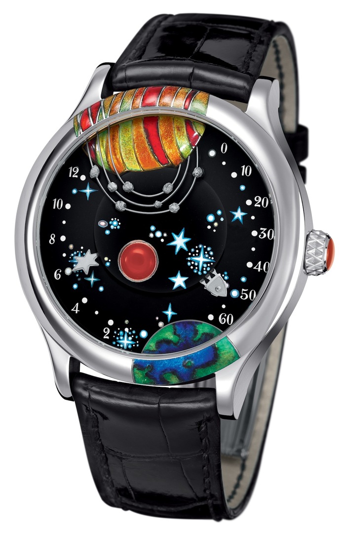
The VC&A piece isn't one I'd found good pictures of before, but it is an amusing piece. The name is "From the Earth to the Moon" and it is a variant of their double-retrograde movement, with the hours on the left side and the minutes on the right.  The dial is a whimsical space scene, with the earth crossing off the edge of the dial at the bottom right and the moon, it really looks more like Jupiter, at the top.  Both planets are champleve enamel and the indicator for the minutes is the space-ship, so it completes the journey once an hour.   The black dial is a polished black jade with a small agate in the middle to represent a planet in the distance. 

38b.jpg

Mid-Century Soviet Photos

| No Comments | No TrackBacks

From the archives of ITAR-TASS come these photos of the Soviet Union in the middle of the last century.

"The Sketches of Industry", V. Koshevoy, 1962
workingroutine-35.jpg

"The antenna of the television center in Moscow", V. Gende-Rothe, L. Porter, 1960

workingroutine-36.jpg

"The construction of a plant", B. Klipinitser, 1961

workingroutine-37.jpg

"Steel balls", V. Hulayev, 1962

workingroutine-39.jpg

"Large-scale chemistry", M. Redkin, 1961

workingroutine-43.jpg

Finally a cityscape to provide a break from all the industrials
"The city on piles. Oil rocks", Y. Rakhil, 1974

workingroutine-41.jpg

(from prophotos-ru via EnglishRussia, the source of the translations. Note that EnglishRussia is NSFW, unless you have ad-blockers enabled)

A

Hublot's Liberty Bang

| 1 Comment | No TrackBacks
Ye that's the actual model name, the Liberty Bang.  As the official timekeeper of the National Constitution Center, I assume replacing nobody - the previous timekeeper, Hublot hasn't ignored this oppertunity to make a limited edition Big Bang watch.  This is based on the 45mm "Classic Fusion" case in black ceramic with the addition of a black sapphire dial.  The dial has been laser engraved with little quotes from the Constitution, the Declaration of Independence and other random documents pertaining to the revolution, with the letters  colored to make the overall image that of the American flag.  Yes it sounds stupid, but take a look and you'll agree.....

Hublot-LibertyBang2.jpg

(source)

It will be produced in a limited edition of 100, with the first one going to this years winner of the Liberty Medal.

A

Transparent Belgian Church

| 1 Comment | No TrackBacks
Built of 100 layers of stacked flat steel plates in the Belgian region of Haspengouw,"Reading Between the Lines" takes the form of a church as its starting iconography.   It transforms from solid to nearly transparent depending on the perspective of the viewer.  Designed by a pair of young architects in Leuven, Pieterjan Gijs and Arnout Van Vaerenbergh, who collectively go as Gijs Van Vaerenbergh, it is part of a larger exhibition project Z-OUT, an initiative in which Z33, the contemporary art museum of the city of Hasselt, presents art in public spaces.

Opaque:
DSDM3618.jpg

The shades of red and brown are from the rust that has accumulated on the unfinished steel structure. 

Transparent
Gijs_Van_Vaerenbergh_Z33_KV_7914.jpg

In this closeup from during construction you can see how the layers are stacked.  As this is still in the workshop, the fresh grey steel has not yet started to rust.
DSC_0780.jpg

These photos are from the artists website, there are plenty more there and a video clip of the actual construction.


A

Eiffel Tower

| No Comments | No TrackBacks
What?  This is completely how I remember it.  The guy on the street doesn't notice anything different either...

tourEiffelp.jpg

Kephallenos 1930s AM

| No Comments | No TrackBacks
The new banner image is taken from an article on Yannis Kephallenos, a Greek printmaker and type designer who was active in the 1930s.  This image is from a cover he designed for Kostas Varnalis' Besieged Slaves (1927). 

Kephalenos font 1927.jpg

(source)

A

Logo Evolution

| No Comments | No TrackBacks
ibm_logos.jpg
A fantastic bit of humor, just go and see for yourself

A

Two more from Richard Mille

| No Comments | No TrackBacks

Two more special editions from Richard Mille(previously mentioned).

The first was for Jackie Chan's Dragon Heart Foundation. This charity builds schools for needy children all across China, and the watch was auctioned as a fund raiser. The piece, in white gold with 'carbon nanofibre' baseplate, has the logo of the Dragon Heart Foundation on the dial in rainbow-anodized titanium. The movement is the usual RM Tourbillon with both Reserve de Marche and torque indicators and their odd, overly-thoughtout mode dial, instead of pulling the crown out to set the time, you click the button once to wind, once more to set the time, and a third time to go back to "neutral". If you were interested, this piece sold at auction for 5.5 million RMB, or about $860,000.

RM_JC_Tourbillon.jpg

(source)

The other special edition from the past month was the RM051 Phoenix, specially designed for Michelle Yeoh. This is a variant of the RM019 with the Celtic Knot motif on the dial replaced with a stylized phoenix, and the case (even the crown) covered in diamonds for some reason. If they had just put diamonds on the bird, maybe the tiny hour indicators, it would have been a interesting, and flashy, watch with a good horological pedigree, something lacking in the current Women Like Crystals (diamonds covering a quartz movement) marketplace. Instead they decided to cover every square mm of the front and sides with diamonds, even the crown is set with white and black ones.

rmmy2.JPG

(source)

In case you're curious, the "plain" RM019 retails for about $650,000 so I'd put this one about $1.1 Million.

A

Amjad Jaimoukha, The cycles of the Circassian Nart Epic Amman Jordan: Sanjalay Press. 2004.

I was hoping for a book of the Nart Epics, and this did, technically, fit the bill,  The book itself is 68 pages, single-sided in a plastic binding and not of high technical quality (it seems one page of foot-notes is missing, some of the footnotes start numbering at 0, etc.).  It starts with an introduction to the Circassians and the Narts, which also seems to summarize some of the tales.  It is not really a scholarly text, the author states facts with no point of reference outside the mythic corpus (i.e. that the Narts killed their elderly at a specific age).  A bit more background information on the different ethnic groups within the overall community would have been welcome, as would a pronunciation guide. 

The bulk of the book consists of the translated myths, and that is of much higher quality. Where possible Amjad has included the original text in both Cyrillic and transliterated into the Latin alphabet alongside the translations and he provides some useful footnotes (e.g. where divergent spellings refer to the same character.  One omission of note, there are several times retellings of the same tale and no clear explanation as to why the divergent forms exist. 

Overall not a great book, but not a bad introduction to a rarely-seen Indo-European culture through their mythic corpus

A
ps this is a great example of how the Harvard Libraries have EVERYTHING
ur_standard.jpg
One of the more mysterious objects found in the excavations of Ur by Leonard Woolley was found in the site labeled Private Grave 779 (PG 779).  It's a trapazoidal box with mosaic on 4 sides, and not obvious function.  Woolley named it the "Standard of Ur" assuming it was some sort of military banner, but there's been little support for that since.  People have conjectured it as a cash-box, a musical instrument and other vaguely-plausible ideas.  Over at the Sumerian Shakespere blog though there's a good defense of the original explaination, based partly of the iconography of the decorations themselves, and some good pictures of the standard as well.  Have a read.

A

Richard Mille - 26

| No Comments | 1 TrackBack
Nobody makes ladies watches like Richard Mille (Previously Mentioned), they tend to fall in the "at least they are not like all the other ladies watches" category.  Rarely are they seen in reality, usually just in super-unreal looking press photos, so this shot of the RM026 in the flesh was intriguing.

rm_026.jpg

(From Amnh over at thePurists)


A

About this Archive

This page is an archive of entries from September 2011 listed from newest to oldest.

August 2011 is the previous archive.

October 2011 is the next archive.

Find recent content on the main index or look in the archives to find all content.

OpenID accepted here Learn more about OpenID