

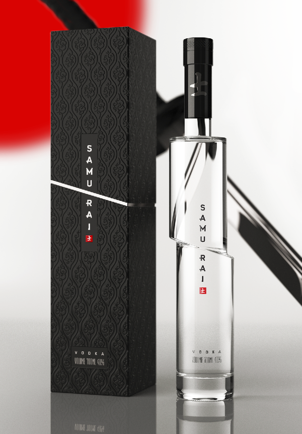
A much less offensive, and quite clever, design for a Vodka bottle, this time a concept fo Samurai Vodka by Arthur Schreiber.
This page contains a single entry by Aaron Macks published on December 29, 2009 9:54 PM.
Hand Wrought Maps was the previous entry in this blog.
Introducing Leon Hatot is the next entry in this blog.
Find recent content on the main index or look in the archives to find all content.
Clever, but I would have liked it more if the logo/name were 'misaligned' with the bottle, instead of remaining in a straight line.
Still, incredibly iconic and simple at the same time, which will ensure it stands out in people's minds, and makes it easy to find at the bar. I find a lot of alcohols come in distinctive bottles so that people at the bar 5 feet from the liquors can still tell the bartender what they want without having to read labels. Those that have a less distinctive bottle shape either have some obvious color choice (especially for clear alcohols), label design, or are mixers that no one cares about anyhow.
Absolut went through a multi-year campaign to establish the identity of their otherwise unnoticeable bottle. Samurai has saved millions in advertising by dint of the instantly recognizable bottle.
> Clever, but I would have liked it more if the logo/name were
> 'misaligned' with the bottle, instead of remaining in a straight line.
I think I'd like it even more if the name was "misaligned" on the box, giving the illusion that the logo slid into a straight line only after being slashed